Brain aided dancing: words and music for the Designers Republic
They created day-glo worlds in a monochrome age. They spurned the apostrophe and left it for dead. They took our separatist spirit and forged the heart of New Yorkshire. Want to know more? Then witness my words and music in praise of the one, the only, the MIGHTY! Designers Republic.
It was 1986, and the Republic was dead.
The Socialist Republic of South Yorkshire – a portion of northern England that had declared itself (rather hopefully) to be nominally outside Thatcher’s dominion – had been effectively legislated out of existence by the British Government. Under its more formal name of South Yorkshire County Council, it had been vaporised along with six other large councils including Greater Manchester, West Yorkshire, Merseyside and, chief among them, the GLC. That is, the Greater London Council: seat of Red Ken Livingstone, whose celebrated/notorious cheap public transport policy had been more or less purloined from us lot up in South Yorks. Well, they say imitation is the sincerest form of flattery. And while flattery can get you everywhere, a mere 2p could also take you a long way back in the early 1980s. Or as far as Rotherham, at least.
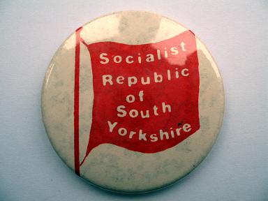
The extent of South Yorkshire’s supposed socialism during those times is a matter for debate, but what is indisputable is that our local authorities – South Yorkshire itself, and the city council of Sheffield – were always ready and willing to spend money as if it was going out of fashion. (Which in fact it was. The recession that Mrs Thatcher brought with her in 1980 seemed to be just the natural conclusion to the 1970s, and South Yorkshire, with its steel foundries and coal mines, took one of the severest handbaggings of all.) As councils that were committed to the provision of public services, particularly to people with few financial means of their own, they spent freely on transport, leisure facilities, parks and gardens. They stood firmly behind the egalitarian principles of comprehensive education – indeed, they pioneered them. They shared platforms with trade union leaders. They forged bonds with CND, with Nicaragua, with the ANC. They openly baited Maggie and her ilk; and they believed that with so many young people suddenly kicking their heels in this era of mass unemployment, you could at least give them something to do. It was all guaranteed to raise the hackles of beleaguered Tories across the county – indeed, the ‘Socialist Republic of South Yorkshire’ epithet had been invented as an insult by the region’s only Conservative MP – but guess what? It kind of worked.
Within Sheffield – at the heart of Free South Yorkshire – there was a current of music making, gigging, clubbing and art production that had been given a helping hand by our nominally socialist council. From the Meatwhistle performing arts project in the mid-1970s, through to the Leadmill, Red Tape Studios, the Audio Visual Enterprise Centre, and no end of theatre workshops, benefit gigs and community art projects, there were plenty of opportunities for young people to have interesting encounters of a creative kind. With just a little attendant worthiness, it was an approach that could be easy to mock – the concept of council-approved pop music is not known for its world-beating appeal after all. But in South Yorkshire, our UB40-toting youth seemed not to care. These council-backed events and facilities – often ridiculed as ‘rock on the rates’ – were used and enjoyed simply because they were there.
Unfortunately, this was exactly what the Thatcher Government loathed. The local authorities’ belief that you could legitimately spend publicly-raised funds on youth projects that might have no measurable economic benefits, but that would broaden horizons, reveal possibilities and simply offer young people an alternative view of the world, was anathema to the Tories. So with a programme of rate capping and abolition, Mrs Thatcher set about destroying the autonomy of these free-spending authorities; the fact that they had been repeatedly voted in by their respective electorates seemed to matter not a jot.
The stage was set then for confrontation as our huge county councils bit the dust and their associated towns and cities had their spending powers seriously curtailed; though in the end – with the exception of events in Liverpool – there was rather less rough and tumble than you might expect. For many of us, the scales fell from our eyes and we realised that our Republic had been more about red tape than red flags; there were a few polite demos, and much bluster in the council chambers, and that was that.
But… it wasn’t quite all smoke and mirrors.
It was an era of ideological Conservative rule, and the whole episode was just one in a series of arrogant gestures on Thatcher’s part that were designed to smash unfashionable old notions like unity, solidarity, togetherness. It was a time of open warfare – in various guises – on British streets; in Belfast of course, but also Bristol, Liverpool, Manchester and London; and not forgetting Armthorpe, Orgreave, Easington. There seemed to be no consensus giving this Government permission to, well, govern. Not in our part of the world anyway. South Yorkshire found itself rejected; its industry crumbling and its people – us – seemingly expendable. Understandable then that, regardless of the bureaucratic manoeuvrings in the council chambers, we might raise a scarlet banner of the imagination and dare to believe that here, we could do things differently. We didn’t vote for her and we wouldn’t acknowledge her power. We were separate, we were ‘other’. As she’d implied during the miners’ strike, we were all the ‘enemy within’.
So although it was 1986, and our supposed Republic was dead, the idea that up here in South Yorkshire we could create a parallel universe of non-London thinking proved attractive. Those years of recession had not killed our spirits, and an extended period on the dole – while still young and free of too much financial responsibility – could lead to fertile years of experiment: cash starved of course, but rich in imagination. In Sheffield, post-punk experimentation had spawned not just a few bands, but also many of the cultural industries to support them: recording studios, venues, record labels, sound engineers, designers. Much more than before, a local music scene could sustain its own offspring, and with it, those music scenes gained a sense of identity that was forged within the atmospheres of the places from which they came. They didn’t want to go down to London. They believed they could do it all themselves. Maybe this was the new Republic of which we dreamed…
—
It was 1987. And the Republic, it seemed, was alive and well.
At the bottom of Howard Street, as you walked towards the station, there was a confluence of dereliction and brick-strewn wasteland. Nothing unusual about that, as Sheffield’s central district was full of such streetscape punctuation; vacant workshops of course, but also World War Two bomb sites that remained undeveloped 40-odd years after the Blitz. Facing this junction was an abandoned car showroom – an ex-branch of Kennings – with an art deco gable end that was perfect for the pasting of flyposters. And being just round the corner from the Leadmill – one of the few city music/drinking venues that existed beyond the mainstream – it really was an ideal location for such propaganda; it was a recession-scarred Piccadilly Circus for the discerning independent music fan.
It was here that I saw it, in autumn of that year. It was a poster; huge, strident and bold. There was red, blue and yellow; there was black and there was white. There was a spangle of stars and a tri-pointed insignia; a Mercedes badge perhaps? The Beastie Boys wore VW; but maybe here, someone was trying to go one better.
There were words too. ‘House Arrest’ it said. ‘The Beat Is The Law’. And above it all, in a star-pierced drop-the-bomb typeface, was the single word: ‘Krush’. It was an arresting design, and I knew who had conceived it. Its signature look was unmistakeable.
I’d read about its creators earlier in the year, in a Sheffield University arts magazine called Arrows. It was an obscure publication – though well known in student journalism circles as the regular recipient of the Guardian’s ‘Best Magazine’ award – and I wouldn’t normally have bought it… except, this time it had a cover I just couldn’t ignore.
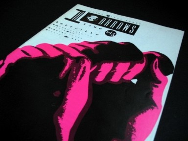
It was gleaming white, with stark black type – an eccentric collision of serif and sans serif fonts, with occasional jarring use of italics; but most startling of all was the pair of muscular fists that lunged across the centre of the cover. It was an expression of industrial strength, the force that had built our city and that had forged its sense of itself; but these fists were not from the monochrome past. They were the most vivid magenta, a colour that seemed mixed for the dance floor, not the factory floor.
I bought the magazine – for ‘5ifty pence’ – and the name of the perpetrators was revealed. They were the Designers Republic.
A Republic, no less. In very rude health.
According to the article within, this was a Republic with two leaders, two citizens, two workers. Namely, Ian Stirling Anderson and Nicholas Giles Phillips. They had a handful of record sleeve designs to their name, a studio that was barely six months old… and yet, every statement they made was loaded with a palpable sense of destiny. This was no pub-corner chinwag; these weren’t the purveyors of idle doodles, designers who just did a few bits for their mates. This interview bore witness to the birth of something self-consciously brilliant. It was part manifesto, part political broadcast, but framed as a gleaming corporate ID. They were giving local indie bands an image that was positively inflammable; but in turn, they were swiping the limelight for themselves.
“Many people regard your work very highly.
Yes they do.
You seem very confident, almost arrogant.
Yes. Next…“
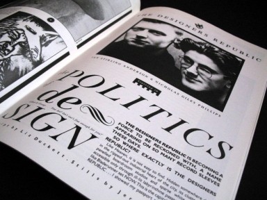
They discussed their work for Sheffield’s FON Records, their day-glo rebranding of Leeds band Age Of Chance. They stated a belief in “the art of pillage” – “(we) steal whenever necessary or desirable… mutating the original until we can honestly call it our own” – and they made a list of the things they truly loved. It was a list that included “consumerism & the hard sell”, “being the best”, “propaganda as language”, “republic beer”. “And most of all”, it concluded, “ourselves”.
It was stirring, seductive stuff. Here was graphic design you could follow like a band, or support like a team. It was shamelessly self-promoting, but it had an irresistible swagger – an alien brand of self-confidence in a city not known for its big mouth. “We design the world,” they said. “People copy us.”

Here, potentially, was a new face for Sheffield’s music; not the sound, but the image it would present to the world. During Sheffield’s earlier era of electro-pop innovation, the city had lacked the infrastructure to support its own musical pioneers – so the labels and producers and image makers had often come from elsewhere. But perhaps here was a different way forward.
FON Records, for example, was a local imprint that was striving to make waves in the wider musical world. Set up by the motor-mouthed music journalist Amrik Rai along with Dave Taylor and significant involvement from the band Chakk, they ran their own FON studios deep within the post-industrial wreckage of the city. It was here that the FON Force production team of Rob Gordon and Mark Brydon began to make its name, while notable visitors included the likes of Sly and Robbie, direct from Jamaica. In ambition, as well as in practice, the FON operation certainly seemed to be thinking in terms far beyond those of most post-punk indie labels, and the Designers Republic were already transforming their image, from sub-Factory gloom into trouble-funking, zebra-striped day-glo. Here was Sheffield – encrypted, but incarnate – and it was my patriotic duty to purchase. When I pulled a DR sleeve from the racks, I felt like an operative collecting a message from the motherland.
Your Republic needs you.
So in autumn 1987, when I saw that vast and vivid flyposter advertising House Arrest by Krush, I was already hardwired to respond. Clearly, something huge had been set in motion. I was seeing the Designers Republic again and again; on sleeves by Chakk, Age of Chance, Treebound Story, and now Krush. These were underground, credible names who were tipped for the big time; erroneously in most cases, though within a couple of months, House Arrest would prove to be a chart-topping pioneer of authentic British house. Still, the effect was cumulative and the message was clear: if you sound good, and you want to look good, Sheffield could be the place.
There was something in the air. That edition of Arrows had sensed it too. In their editorial, just above their shout out to “Nick and Ian, of Designers Republic, for the time, effort and enthusiasm they have put into the striking ‘Industrial’ design that appears on the cover,” they suggested that “Sheffield’s cultural, artistic and musical fronts are showing tremendous potential” even though “the industrial forecast is not very positive”. They paid clumsily-worded credit where it was due: “Involvement with a Sheffield renaissance is greatly found with the City Council itself, supporting many community arts projects”. And there followed a succession of articles about Sheffielders who were doing it for themselves: Forced Entertainment theatre company, Dave Taylor of FON, Jools from the Leadmill, the artists of Pitt Street Studios – and of course, DR themselves.
This sense of support and self-sufficiency within the city was to serve the Designers Republic well over subsequent years. It was a spirit that seemed to spring directly from the grubby waters of the Don; and what with all that delicious ‘republic beer’, it seemed that DR had drunk deep of it. There would be pioneering club nights, era-defining music and bands that would conquer the world – or its independent edges, at any rate. Whether they were genuinely the city’s children or merely fellow travellers, the Designers Republic would make sure they looked their best.
Eventually, that poster would fade and peel away, but the abandoned car showroom to which it was stuck would become a core component of the ‘Cultural Industries Quarter’ – a direct descendant of cultural policies established during the Socialist Republic of South Yorkshire era – and within a handful of years it would be a fashionable art cinema and a centre for media businesses; with tenants including – who else? – the Designers Republic.
But in the autumn of 1987, that was all still to come. I would buy ‘House Arrest’ by Krush because of its sleeve; and I would like the record within partly because of the way it looked.
And not for the last time either.
Which brings us to Brain Aided Dancing, an MP3 mix dedicated to music wrapped by Sheffield’s legendary design house. Every track included in the mix is plucked from my own music collection; sometimes bought for the sound, sometimes for the sleeve, and often a bit of both. It’s therefore a highly personal response to the Designers Republic’s work and the music within; there is certainly nothing comprehensive about it, and I’ve made no attempt to create a definitive record of their 20-plus years’ hard labour. Rather, I have tried to engineer a mix that works on its own terms but that also stirs in a few of my favourite examples from their back catalogue. There are singles and there are album tracks – all were eligible so long as the sleeve bore the DR name.
It’s a more complex beast than its sister mix, Destroyed By Gods, but it comes from a similar place: a Sheffield of the ears and of the mind.
So open your eyes to the music and prepare for my battle hymn of the Designers Republic. This is Brain Aided Dancing.
THIS IS SO BRASH!
Track one
Age Of Chance – This Is Crush Collision
From the album One Thousand Years Of Trouble (1987)
‘ONE THOUSAND YEARS OF ARTWORK MADE IN THE DESIGNERS REPUBLIC’
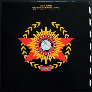
What a place to begin. We’re in a dismal student bedroom in Coventry: this town, as you know, is coming like a ghost town. Across the floor lies a carpet made of ground-in dirt and fibres that are the International Colour of Spearmint: that is, insipid green. Across the walls, there’s vinyl wallpaper blotched with white emulsion, though not enough to obliterate the patterns of the 1970s that are soaking through. And across my mind, there’s a sullen cast; after all, this city shuts at midnight and hedonism is on the ration.
In this house there roam potential suicides, and I need some release!
I snap the clip on my record box and tuck my hand inside. I flip, flip and flip again… and I have it. Out it comes. A 12″ square of deepest black. In its centre sits the emblem of an unknown regime, one beholden to beat domination. Its capitals, apparently, are Leeds, Detroit, Berlin, New York.
I slide out the record and hover it in the air between my palms. I squeeze it over the stereo’s spindle then push it down into place. It starts to spin, and the needle drops, and the grooves begin to work their magic.
If you listen, you can hear it coming – the percussive chink of industrial rhythm. Back home in Sheffield, it’s a sound we’ve come to identify with the music we make; a sound apparently forged by hammers, like the fiery ingots our factories are supposed to produce.
In Leeds, the city from which Age Of Chance come, there’s no such tradition to tap into. Their industry is based on textiles, which produces a distinctively different audio library, I’m sure. And even their recession isn’t biting quite like ours. Leeds is a city built on commerce as well as industry, and it’s facing the 1980s in more robust fashion than its lowly neighbour 30 miles to the south. Before the century is out, their citizens will even be shopping in Harvey Nichols; though right now, in 1987, that seems unlikely – even for <spit> Leeds.
Harvey Nichols? Who the fuck’s he?
Still the beat comes. Steam hisses, doors slam, sirens wail; there are cash tills, car horns, a downtown cacophony cut ‘n’ pasted into place. Only, this isn’t the sound of Britain in the grip of Thatcher’s vice. This is an audio city sprung from the movies and from the mind of Marinetti, some kind of time-warped Futurist apocalypse; it’s the music of industry, the din of commercial war. So drop the bomb and pump up the volume.
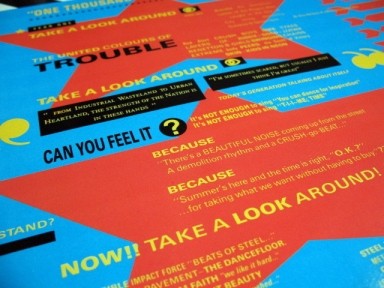
This crush collision of industry, funk, hip-hop and noise is sharp as a needle and ultra bright. For all its mayhem, it’s a glossier rendition of social breakdown than was ever produced by the likes of Cabaret Voltaire. It’s plastic and disposable, not heavy and grim; and that sleeve! It’s like Blast magazine sponsored by Pantone and CNN; more slogans, more colours, more EVERYTHING! And still the beats fall; this is global annihilation soundtracked by Motown and the MC5. Armageddon, it seems, is going to be FUN!
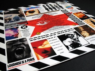
Age Of Chance were a guitar group that didn’t want to be ‘indie’. I recall a review that characterised them as a band “that a certain kind of white boy thinks is really ‘on the edge'” – by which was meant, I think, their self-conscious love of the dancefloor, their belief in the redemptive power of sampling, their urban sloganeering and, I suspect, the way they spurned the trenchcoat and cardigan du jour in favour of Tour de France jerseys and thigh-hugging shorts. So was I that ‘certain kind of white boy’? Alas, I fear I was. While their thrash metal sociology may have seemed transparently arch even then, the visual kicking delivered by sleeves like this meant that I was utterly powerless to resist.
I find it impossible to imagine the Designers Republic without their work for Age Of Chance. In creating a context for the soundbites and slogans, they also perfected their vision of themselves. Having travelled with the band on their journey from FON to Virgin Records, here was major label vindication – with a budget that suddenly matched their dreams; they had the outer sleeve, the inner sleeve, the colours and the gloss. Here they could be what they wanted to be: cinematic, propagandist, revolutionary and IN YOUR HAND.
And now… the sound caves in, and it counts us out. We’re back in my dismal student bedroom, though this isn’t really where we’ve begun.
Our starting point has been the destruction of the world. So… where do we go from here?
Track two
Chakk – Timebomb (1986)
‘SLEEVE DESIGN AND ARTWORK MADE IN THE DESIGNERS REPUBLIC’
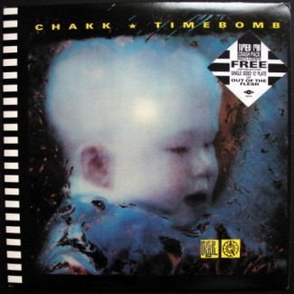
Truly, this was an explosive age. From Tripoli to Brighton, from Goose Green to Kabul, the scent of cordite was hanging in the air. And then there was the Cold War chill – the nuclear threat. There was Protect And Survive and When The Wind Blows; and as if they weren’t enough, there was Threads – a TV drama in which Sheffield, my own city, was wiped off the face of the Earth.
You can hear it in the music of the age – among the Sigue Sigue love missiles and the sonic boom boys. There were detonated basslines, drums like hurled shrapnel, landmines of booby-trapped funk. In this very sleeve you find missiles concealed, cross-hairs on target, the graphic language of conflict and preparation for war.
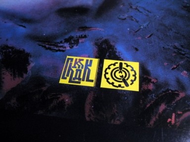
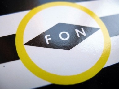
You’re either Right or Left, Good or Evil. Black or White. The monochrome edging that defines the spine of this sleeve is the visual identity that DR created for FON. According to the interview in Arrows, the brief was to make their records “immediately distinctive and easily recognisable from all angles; front, back and spine”; it won’t be the last time we see it in this mix, and even when the spine design itself is absent, the clash of polar opposites it represents often remains at the heart of the concept.
Timebomb was Chakk’s return to FON after a year and a half on MCA. That particular major label deal had stopped Sheffield musicians in their tracks; people were amazed at MCA’s largesse in the face of just a couple of 12″ singles, as the band were promised a reputed £600,000 predicated on what even bass player Mark Brydon admits was the silver tongue of manager Amrik Rai rather than actual commercial potential. They spent a quarter of a million quid building FON studios, but then the tensions inherent in the deal seemed to twist them out of shape; they lost their experimental edge while failing to turn sufficiently Pop, and in no time the MCA deal was dead.
For the record, they say they never got all that cash.
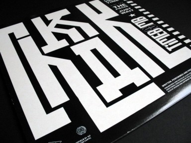
So after all the promise and disappointment, the comings and the goings, how did they eventually sound?
Well I think this is Chakk at their finest. I doubt anyone in the band would agree, as they were surely striving for the elastic multi-layered funk of their earliest singles, but this sound is taut and self-disciplined; and I love the mechanical chug of that dominant riff. I had to persuade myself to like their earlier track Out Of The Flesh, but this adoration comes naturally.
But then, it does have the best sleeve. And as I’m discovering, that can account for an awful lot.
Track three
Sun Electric – EYA (Green Velvet Funk Mix) (1997)
‘DESIGN BY THE DESIGNERS REPUBLIC’
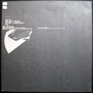
And so we leave the clamour and dread behind us – for a few minutes, at least. Thatcher’s Britain suddenly seems a curiosity destined for the history books; if indeed it really happened at all. Did we dream it? Were we actually there?
Like characters in The Twilight Zone, we step through a portal of fog and find ourselves in the middle of a crowd – or more accurately, an undulating mob. But this mob isn’t armed with petrol bombs and bricks; it isn’t ranged against shields and dogs. These people look happy for a start, which makes a change; in fact, they’re positively beaming.
We are in a dense and dark fluoro-edged nightclub; ceiling low, humidity high. The people smirk, they sweat; they grasp, and clutch, and hug. And around us pounds a rhythmic wallop that seems driven by the eternal production line of the soul. Relentlessly surging, it retains the regular tempo of industry, but this is mass disco propulsion for a white-collar age. It is Chicago’s jacking sound distilled and refined; combined with Germanic technology, it fuels the mystic force of the night.
The track is by Sun Electric, but it was Green Velvet’s name that prompted me to pluck it from the rack. In early ’98, he was lined up to appear in DJ guise at Voodoo, Liverpool’s underground techno furnace, and this prospect so electrified me that his ethereal presence consumed my dreams. I tossed and turned through the wee small hours, and dreamt that I had been plucked from obscurity to warm-up the club before he took to the decks. And so it was that I appeared in a dreamworld Voodoo, under the DJ name I’d concocted for the night. Which was… Purple Helmet.
He’d be flattered if he knew.
Partly under the influence of Green Velvet, Chicago house in the mid-1990s felt reborn. For his Cajual label, he mixed the sweetest house vocals with a little disco sleaze and spooned the resulting mixture over lumpy, dirt-edged grooves. Meanwhile, for his Relief Records label, he explored Chicago’s shadier districts, tuning into the fading echoes of Phuture and Sleezy D and turning them into beefed-up, stripped-down jack tracks overlaid with kooky, gruesome wit.
This remix is a product of the latter tradition; it’s a steady-paced hypnotic workout with a tantalising edge of darkness. Not too dark though; it remains a soundtrack to abandonment and pleasure. Perhaps you can smell the poppers?
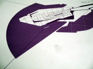
By this time, the Designers Republic had achieved global, if still niche, renown. Nick Philips had long since left, leaving Ian Anderson to ring-master the whole operation along with his chosen new Republicans. One such was Michael Place, a designer of awesome mould-breaking talent, whose love of seductive print and willingness to believe in the DR DReam helped earn his place in the heart of this mix.
For this sleeve, he continues the architectural deconstruction that recurs throughout his work: these are blueprints and plans thrown awry by the vagaries of technology – as if the laser printer has got its wires crossed. There are overlaid grids and structural fragments; three dimensions flattened and twisted skewiff. In contrast to the riotous assembly of sleeves that launched the mix, this is understated stuff; a hymn to quiet contemplation and technical abstraction.
At least, I might feel calm and contemplative – had not some Vicks-smeared loon with his top off just squeezed me to within an inch of my life.
Track four
The Step – Yeah You! (1991)
‘IT’S THE DESIGNERS REPUBLIC… STEPPIN’ OUT!‘
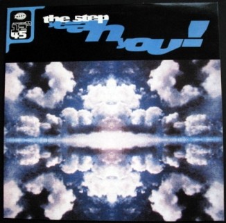
The powerful bass pulse that opens Yeah You! is straight out of Sheffield, stardate 1991. Combined with the hollow percussion that follows, it’s the stumbling four-four clunk of Occasions nightclub on a Saturday night – but this time, instead of test tones and studio bleeps, we get a luscious female vocal with sampling potential aplenty. In truth, there’s nothing out of the ordinary about that: while Sheffield’s dance sound of the early 1990s is often characterised as steely techno with an avant-garde edge – not least by me – the actual experience of attending those pivotal club nights could be rather different.
Crucial to the rebirth of a self-consciously Sheffield dance sound were the DJs Parrot and Winston. They had tirelessly built night after night across the city; from community centres and local dives to the splendour of the City Hall Ballroom, they had given house music to the city and nurtured a very mixed black/white scene. The result, by mid-’90, was the humidity and madness of Occasions, where there were sweat-drenched faces, smashed up bogs and locked-off taps galore – all the trappings of the nascent rave frenzy.
But despite all the hands-in-the-air and the airhorns, Occasions retained a heart that was ‘rave’ in the jazz/soul sense rather than in the sense of the Belgian Hoover. With roots in soul and breaking – and real dancing rather than that white boy bobbing around shit that I do – Parrot and Winston’s experimental electronic gear was still plugged into secret black technology rather than E-fuelled, funkless noise generators; thus a typical Occasions set mixed Unique 3 and LFO with real songs, real tunes and records with soaring passion. That was just how it was; this was never a scene with a single beat, and Yeah You! is Parrot and Winston making sweet music together – with their very own dancefloor in mind.
Note: this was Parrot and Winston together. By the end of ’89 and into 1990, when the new Warp Records label was enjoying a serendipitous rise – it had slipped into the void left by the imploding FON project, learning lessons from the latter’s untimely demise – both Parrot and Winston were contributing to its pioneering sound. Winston was with Forgemasters, creators of WAP1, the Track With No Name; and Parrot had partnered Richard H. Kirk in Sweet Exorcist, whose Testone 12″ had gifted the label its bleepy reputation. The pair sat at the heart of what had become a celebrated Sheffield scene – a new musical Republic? – with attendant broadsheet press attention threatening to make ‘Sheffield house’ into the Next Big Thing; though the concurrent rise of Madchester helped ensure that it remained very much a connoisseur’s pleasure. But the city wanted to hear what these lads could do together, and The Step was the result.
Yeah You! mixes up their influences into one distinctive city sound. You can hear the house and the garage, the electro and the soul – but with a pronounced hardcore thump rather than silky anonymity. This 12″ even came with its own Occasions Mix – directed at the heart of the city’s hottest dancefloor. In fact, the whole thing retained its authentic Sheffield edge, just as Warp was about to start looking beyond Yorkshire in order to secure for itself a longer-lasting legacy. Joining Parrot and Winston in the sleeve credits were a host of Sheffield artisans: production was by Mark Brydon, one-time bass player with Chakk and subsequently one half of the FON Force team; the cover image was by Phil Wolstenholme, who went on to create ground-breaking CGI illustrations for Warp’s famed Artificial Intelligence series; and the overall package was licked into shape by DR, moving Warp on from their original generic lilac sleeves into a world that was glossier, moodier, but still recognisably their own. By now, that lonesome logo on the flip really meant something.
Track five
The Funky Worm – Hustle! (To The Music…) (Predora Mix) (1988)
‘SLEEVE DESIGN AND ARTWORM BY I ♥ MY DESIGNERS REPUBLIC’
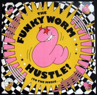
From the Jive Turkey came the Funky Worm; and from the minds of the Designers Republic came this rhubarb and custard concoction – as if the Hannah Barbera art studio had ingested its own weight in psychoactive compounds. Stoopidity was all over this track, from the sleeve featuring Soil Brother and the gang, to the Funky Worm’s appearance on Top Of The Pops complete with outsized Bill And Ben accoutrements.
Forget Danny Rampling and Shoom. It was this lot that put the acid into house in 1988.
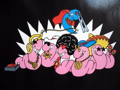
This crisp house production with its northern soul spirit and rare groove licks was the kind of thing that sent Sheffield crazy during the Summer of Love. And despite its obvious connection to the sounds that had been coming over from the States for a couple of years – and that Parrot and Winston had been championing at their many local nights, including the celebrated Jive Turkey – it was a determinedly Sheffield production once again. With the omnipresent Mark Brydon on production, and even an appearance from Chakk’s Sim Lister on sax, Funky Worm was the dressed-up, tastefully sweaty Jive Turkey spirit in vinyl form. Its nominal members were the DJs Parrot and Ping Pong, plus vocals from Julie Stewart – who had appeared in my school’s production of Gregory’s Girl a few years earlier – but in essence, it was the public face of the whole crazy scene; from Jive Turkey to FON to those nutty boys at DR.
Heavy pirate radio rotation and big love from the southern soul brethren turned it into a cross-over hit, and it reached number 13 in July ’88. No doubt the goofy delights of the picture bag helped too; DR’s FON zebra striping is now an Op Art bed out of which the madness explodes, but the stars, of course, are those juicy funky worms themselves. FON was surely setting the stage for more future worm action – though the follow-up single The Spell never made it out of the compost heap, and a year later, FON as a label was effectively dead.
Track six
Moloko – Tight Sweater
From the album Do You Like My Tight Sweater? (1995)
‘THE DESIGNERS REPUBLIC’
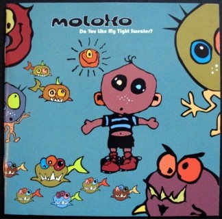
Major success, minor DR. I plucked this album from the rack in a none-more-mainstream branch of HMV, intrigued by the li’l cute feller with the onion shaped head; and it was only as I read through the credits on the back of the pack that I realised I was holding Mark Brydon’s latest stab at commercial success. We’re six tracks into this mix and he’s had a hand in four of them, which makes it only right that as Moloko, he got a bit of proper pop star action after so many years of service.
The gloopy wigged-out weirdness of Moloko helps us calm things down and change the mood, and as we float back to Earth, we can watch those curious cartoon beings drift past, like sea monkeys in a tank full of Smirnoff.
Track seven
Junk – Your First Kiss Was My Last Breath Pt. 1 (1987)
‘SLEEVE DESIGN AND ARTWORK MADE BY THE DESIGNERS REPUBLIC IN CUCKOOLAND’
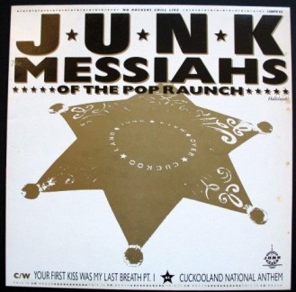
It’s gold and black; it’s got stars galore. This is Junk, the sound of Yorkshire country rock circa mid-’87; not a record I would have bought based on the sound alone, devoted as I was back then to dehumanised machines and samples that were close to the edit. In fact, not a record I would have ever bought had it come in a plain old white card sleeve; but thanks to the strutting arrogance of those demented Western graphics – like P.T. Barnum promoting Public Enemy – I handed over my £1.49 and came to terms with the fact that I’d just bought a record you could describe as – whisper it! – rock!
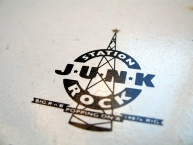
How perverse then that while I found this sound to be wildly unfamiliar, and an acquired taste at best, the sleeve itself is possibly my favourite in this entire mix. Given that I know the band were local lads, it’s the layering of wonky American influences that impresses; hip-hop slogans plucked from their context, twisted with tumbleweed and blown back across the prairies – though it might be Rother Valley Country Park. “No rockers chill like Junk”; “Yo! Junk boys don’t shoot it up!”; “Big R n B popping on a 1987 rig”. Are we listening to Wolfman Jack as we pull into a drive-in movie? Or are we about to battle Bambaata?
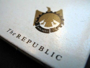
We also get the most beautiful rendering yet of the original Designers Republic logo, representing the might of Ian Anderson’s newly-birthed regime: down in the bottom right corner on the back of the sleeve, there’s a solid gold eagle, wings spread, behind the symbolic wheel of industry. The REPUBLIC, it says.
It could be the insignia of a fictitious East European state – the kind of place that Tintin used to end up – but it was this totalitarian marque that guided me to the Designers Republic on the one and only occasion I had cause to cross its border. It was summer 1989, and I was back in Sheffield after fleeing that mildewed Coventry bedroom for good. I’d been tipped off by a friend of a friend that Ian Anderson and a guy called Rob who ran the FON record shop were planning a Sheffield listings guide called Font. There had been attempts to do something similar in the past, but the city never seemed able to sustain such mags beyond a couple of issues; however, maybe this one would be different, given that DR would design it, and it would benefit from the musical connections of Rob. It was worth a try.
So this friend of a friend suggested I should go and see them and offer my services. “Doing what?” you ask. “Good question,” I reply. I didn’t know what they wanted, and I didn’t know how I could help, but I gave them a call in any case and booked my appointment to see them. “Meet us at the Designers Republic’s place,” said Rob. “It’s across from the Rutland Arms. You’ll recognise it by the nasty symbols on the window.”
Nasty symbols?
I queried the phrase.
“Not nasty symbols,” he said. “Nazi symbols.”
Oh, that’s all right then.
And there they were, quite small, emblazoned across a series of first floor windows on a low-rise business unit in town. I was more than a little awed, but I swallowed my nerves and made my way inside; I was greeted by Ian, who was in the process of taping records – “All the free ones we get,” he said. Rob joined us too, and we chatted about the magazine and what it might contain. They really needed someone to do the donkey work, compiling addresses and phone numbers, digging out the contacts that a listings mag might need. It was a matter of just giving it a go and seeing if we could make it work.
By the time I left them I was fired up and ready, but just days later, I realised I didn’t have a clue. In pre-internet times, collating all that info didn’t seem such a simple task, so I called them back and said I couldn’t do it. As far as I know, Font never did emerge, though I’m sure it bothered neither of them too much. Ian had DR of course, and Rob? Within a matter of months, he had a record label of his own to worry about. A record label called Warp.
So that’s the tale of how I didn’t get to work with the Designers Republic. Now if you’d like to dry your eyes mate, we’ll move on.
Track eight
Pulp – Babies (1992)
‘THE DESIGNERS REPUBLIC’S PROUD YOUNG FATHER’
It was obvious to everyone. With this single, Pulp changed.
For years and years and years they had been the ‘ones to watch’ on the Sheffield scene, with their bubbling psych-pop sound and their dash of conceptual grandeur. But throughout those years they had also been home to a frustrated mind; that is, the mind of Jarvis Cocker, a boy with big ideas but possibly not the distance from his sources to really nail the finished article.
I mean no insult here; in fact it often amazes me how the world of pop has managed to produce so many truly dazzling young talents. I mean, I know that classic pop is often the music that magics into being the very essence of being young, but if I think about my own adolescent years and the reams of doggerel I produced in pursuit of some lofty dream, I tend to think they say a lot about being young, but not in a way you would actually want to read. That so many young soul rebels have managed to crystallise their experiences in the form of great pop music – while actually being young themselves! – has long been a source of wonder to me. And of jealousy – possibly murderous.
I would humbly suggest that even Saint Jarvis of Intake himself, while displaying a singular pop vision from an early age, somehow needed to look back from the future to truly understand the stuff that was worth writing about. His pop is about distance and observation more than it’s about being in the moment, and his true voice would only make itself heard once a few years had passed and, crucially, Sheffield was no longer his home.
And this turned out to be the moment it happened.
Forever falling in and out of love with shoddy little indie labels, Pulp’s potentially broad horizons for so long seemed to end somewhere around the Tinsley cooling towers. But by ’92, with Jarvis now London-bound, and with going on for 15 years of studied microphone manipulation under his belt, powerful forces were stirring. As Mark Sturdy tells it in his book Truth And Beauty, they were wanted by Island Records but were unable to break free from a stifling deal with Fire. While they were minded to just walk away from the seemingly apathetic indie, everyone concerned knew that Island’s millions would look tantalising to the spurned label, and legal action could well follow. One way out would be to begin recording for another ostensibly penniless indie label – and then after a respectful period of time, shuffle seamlessly on to Island.
The sympathetic independent label with whom the deal was cooked was Warp; Jarvis had worked with them previously, making the video for Sweet Exorcist’s pioneering bleep fest, Testone. So Island financed some recordings while Warp established an indie offshoot called Gift in order to release them… and Pulp themselves patiently waited for their lives to change forever.
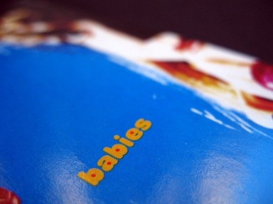
Babies was the first in a series of three singles on Gift, and from its opening riff through to its closing “yeah yeah yeaaaaaah”, it’s devastating Total Pop. For a start, he writes about what he knows; he puts Sheffield’s estates up there with the Beach Boys’ California as a landscape worth dreaming of – though with Ed Buller handling production duties rather than the likes of Ken Patten and his suburban semi-detached studio.
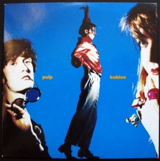
But Babies was much more than Peter Tinniswood with guitars. The hooks, the melodies and the sense of supreme pop confidence told us that Pulp had come of age. The whole package spoke of a new professionalism, and that includes the pop mag ad shoot look that the Designers Republic gave to the sleeve. This is one of the first CDs I ever bought, and compared to the cardboard acreage of the 12″ singles in this mix, it undoubtedly feels diminished; but on the other hand, it’s got a cute thing going on – not twee, but charming, colourful, innocent.
Here is a band on the cusp of special times.
Yeah.
Yeah yeah yeah yeah yeah yeaaaaaaaaaaaaaah.
Tracks nine and ten
Subsonic 2 – DJ Cassrock Don’t Care and Addicted To Music
From the album Include Me Out (1991)
‘FASTER DYNAMO AD: DESIGNERS REPUBLIC THRILL! THRILL!’
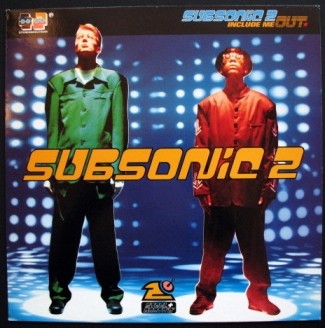
This hip-hop is dopey – but not like Cypress Hill. I mean dopey like the dwarf from Snow White. It’s jolly stuff indeed: whipped into an irresistible froth, it invites a quick dip of the finger as much as it discourages prolonged consumption. In truth, the vocal by MC Steel is a low-calorie rap – it’s thin and lacking in flavour. But it’s fun while it lasts: self-deprecating hip-hop dosed on NHS orange juice, cooked up on the mean streets of Sheffield and Nottingham.
So the music is smiley-faced rap with a South Yorks/East Midlands twang; but what about the sleeve? As you can see, the Designers Republic were in the process of turning Japanese, cramming the corners with cute icons, visual candy, little treats to dig out and chew. While the noise and clamour of the Age Of Chance days remains, this is also a nu-look DR for the 90s: the nods are to Tokyo rather than Moscow and Berlin; the cutting and pasting is done with a mouse instead of a scalpel.
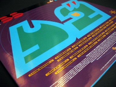
In 1991, Japanese graphic art wasn’t widely recognised in the UK – as far as I knew, at least. Ignoramus that I was, the last I’d seen of Japan’s cultural flowering was when the Blue Peter team visited Tokyo in 1981, and the wholesome presenter Simon Groom had shown us the teddy boys and beehive girls of Tokyo’s belated rock ‘n’ roll cult. The Japanese were clearly filtering Western influences and getting them a little bit ‘wrong’ – and while the love of rock ‘n’ roll seemed to be essentially a brightly-coloured pastiche, leading me to believe they were not developing a youth culture of their own, I was actually wildly mistaken. Because when Western graphic art – think of the logos and neon lights of Piccadilly Circus or Times Square – came to be twisted by the Japanese beyond recognition, they created something entirely new. It cross-bred with their comics and gadgets, their noodles and toys, and before long their cutesy, kooky, krazy-koloured graphic world would be one we would recognise everywhere – but here we see DR as early adopters of a style that many of us didn’t yet know existed.
Perhaps I should speak only for myself, so here goes: I thought DR had invented this look. Hands up if you did too. I don’t even mean to denigrate their achievement; they perfected a version of the stuff that filled Japanese supermarket shelves, but they mixed it with their own ideas and influences: big slogans, Sheffield Wednesday, the stains of rain on concrete. In the end it becomes something superficially similar but simultaneously distinct from the original source. And then it evolves under the pressures and influences of its own local conditions, and ultimately becomes a different species entirely: so ultimately Subsonic 2 begets Wip3out, begets Blech, begets Gatecrasher… and on and on.

Incidentally: back to the music.
“Be sure you don’t succumb to the simple technique,
Of gettin’ a new fix of remix every week.”
Hmmm. Now he tells me.
But at least it kept the Designers Republic in work all those years.
Addicted, indeed.
Track eleven
The Orb – Perpetual Dawn
From the album The Orb’s Adventures Beyond The Ultraworld (1991)
‘ORBSONIC LOVE DEEP SPACE & SAMPLING IMAGE IN THE DESIGNERS REPUBLIC’
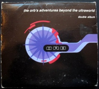
An admission: I was never that crazy about the Designers Republic’s work for The Orb. It did please me that here was another zeitgeisty band whose concept was partly defined by Sheffield’s favourite graphic explorers, but the actual look of the artwork was a little less than compelling. Or maybe I was just getting used to it.
The Orb, of course, were all about outer worlds as metaphors for inner space. While their immediate progenitor was the club chillout room, in which Alex Paterson and cohorts could meld downtempo dance with expansive dubscapes, they also paid a heavy debt to the spirit of Dark Side Of The Moon. Orb tracks were music in cloud formation: floating, bulging, dispersing. DR responded with the depths of deep space and indefinable shapes. It lacked the focus and clarity of their greatest work, and while there’s no doubt it suits the mood of the music – and what else were they meant to do? – I don’t gaze at this stuff and wonder at the genius that made it happen.

As for the track itself, its uptempo skank is not typical Orb, 1991-vintage. But it suits my purposes here, and besides, my subconscious may have played a part in its selection. When I first met the woman who is now my wife, this album was on heavy rotation in her bedsit. Her only CD player was a small Sony Discman plugged into her hi-fi, and its temperamental ways would occasionally render the most delicately scratched disc unplayable. Unbeknownst to us, this album’s second disc would always get stuck halfway through the first track – which was this track. So while we would fall asleep to its loping beat, we would also wake up hours later to its continued refrain; in our semi-dream state, we didn’t realise it was the same track, still playing; we just thought it was a very repetitive, very long album – some kind of bonus disc perhaps, with a very extended remix.
A few months later, she got a new CD player for her birthday – a decent one this time. And it was only then that we discovered the rest of the tracks on this album.
But it isn’t any of those tracks that appear here. It’s this one, Perpetual Dawn. A rather apt name, in the circumstances.
Track twelve
Sweet Exorcist – Testone (Winston & Ross Remix)
From the album Warp 10: Remixes (1999)
‘DESIGN BY THE DESIGNERS REPUBLIC’
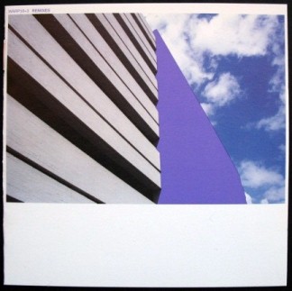
I can’t deny the thrill when this track kicks in. If The Orb were causing attention to drift, Testone as refashioned by Winston & Ross adds some wallop to the mix, snapping us back to reality. We’re no longer probing outer space in an intergalactic bong; we’re actually dodging Leeds fans in the underpass, or giving Castle Market skinheads the slip. This isn’t merely hypnotic repetition. It’s the ritual of avoiding a Friday night kicking, again and again; riding your luck on the long walk home, too skint to pay for a cab – but still worried every step of the way.
Just look at that sleeve. It features the kind of brutalist concrete that I assumed would one day cover the world; and that was neither a good thing nor bad. It was just how things would inevitably be. It’s a photo by Michael Place of DR, partially obliterated by Warp Records Purple; like International Klein Blue, it’s a chromatic signifier that’s dense with meaning. It was the colour that wrapped the first Warp record I ever bought – which was the Testone original – and so how appropriate that as the label celebrated its tenth anniversary in 1999, it would drench the world in that self-same shade of lilac; a colour I would once have associated only with the lined up products in my grandmother’s bathroom, but which now radiated bass-heavy techno isotopes rather than the headachey scent of lavender.
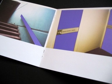
Warp released three compilation albums to mark their tenth year. The first dealt with the sparse Chicago jack tracks and black-British mutant forms that had such an impact on Sheffield dancefloors; the second compiled the lilac-sleeved originals that had kicked off Warp’s decade-long experiment; and the third, from which this track is taken, allowed an army of remixers to do battle with the master tapes in Warp’s lead-lined vault. Given that independent labels blow up and go to the wall continually, ten years in business was no mean achievement for Warp, and the combined bulk of those compilations felt like an appropriate way of marking the occasion. More than that though, they felt a little like the end of the beginning; because Warp was about to leave Sheffield and become a London label; partly because the day-to-day business of work would be made a bit easier, and partly because Rob and Steve, the label’s founders, were at a stage in life when perhaps experiencing life differently was simply an attractive thing to do.
Sound reasons, I’m sure. But if you’d spent Saturday afternoons loitering in the Warp shop ten years earlier, and loved the music partly because of where it came from, it also signalled an irrevocable break. Warp hadn’t really been in the business of marketing Yorkshire’s Noise for a long time, but here was the proof. Time to just accept it, and move on.
Except of course, the Designers Republic didn’t move on in that way. They remained spot-welded to Sheffield; the city’s echo could still be heard in every click of their mouse. Which is not to say that their individual designers didn’t come and go. Of course they did. And Michael Place, whose matter-of-fact urban photography filled the pages of these Warp 10 compilations, was already preparing a venture of his own, called Build. In London.
But DR, as both idea and as physical presence, didn’t leave. And somehow, they ensured that a corner of those concrete fields remained forever purple.
Track thirteen
LFO – Shove Piggy Shove
From the album Advance (1996)
‘ADVANCE DR: 1756/63’
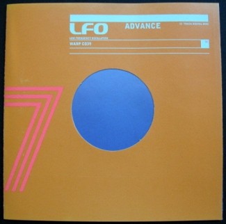
This heavenly sequence continues. That signature LFO sound – a reverby, melodious scrunch – chimes again and again, like divine bells marking the birth of the universe. It’s a music that echoes through time, bearing witness to the cruelty of the night: we hear it as we walk home alone; as we lock up and tiptoe to bed; as the room begins to spin; as unconsciousness descends. And even as we sleep, it soundtracks the depths of that unconsciousness; and we’ll be back next week for more of the same; because tonight’s unrealised possibilities will be, once again, possible.
Track fourteen
Love Street – Galaxy (1988)
‘GALAXY GRAPHICS BY THE DESIGNERS REPUBLIC STARSHIP TROOPERS’
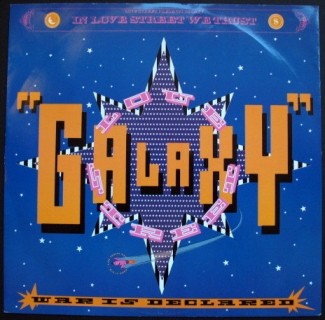
In 1977, War’s ‘Galaxy’ was a big fat slab of meaty funk. With a flame-sealed rump, its interior was medium rare and dripping with authentic funk flavours. However, 11 years later, after a few days in the FON Force kitchen, it emerged as desiccated space food; the juicy funk goodness had been dried out, and what remained was this synthetic dance substitute. Which was somewhat hard to swallow.
Who knows what Parlophone hoped would happen when they snapped up this FON Records supergroup? I’m sure they had fingers crossed for another Funky Worm or Krush sensation; with sonic explorers including Jake Harries of Chakk, Krush’s Ruthjoy, Rob Gordon of the FON Force, Soft Cell’s Dave Ball and even Stephen fucking Mallinder from Cabaret Voltaire! it feels like a self-conscious attempt to align the funk planets with Sheffield’s Jive Turkey vibe.
With the Designers Republic delivering some kind of stars ‘n’ bars supernova – with FON zebra stripes present and correct – the mission was clearly aiming high. Unfortunately, Mal’s bone-dry vocal style is seriously lacking in funk-muscle, and what should be a booming dancefloor rumble for the Summer of Love generation ends up sounding distinctly hollow. Even the Studio 54 moon man – whose cocaine spoon has been replaced by an E-fiend’s rictus grin up in the top corner of the sleeve – can’t inspire hands-in-the-air abandon.
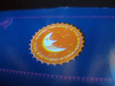
So… if it’s all so uninspiring, what’s it doing in this mix?
Well DR’s contribution remains fun, and the concept was worth a try. Stephen Mallinder had long harboured full-on dancefloor ambition, and with Cabaret Voltaire recently abandoned – albeit temporarily – I’m sure the FON connection promised at least the potential of genuine commercial success. However, it remains a curiosity; though one that leads us in the direction of a bone fide commercial smash…
Track fifteen
Krush – House Arrest (The Beat Is The Law) (1987)
‘SLEEVE DESIGN & ARTWORK COMMITTED IN THE DESIGNERS REPUBLIC’
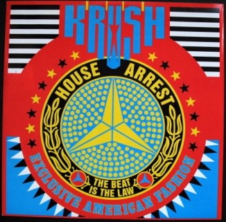
Ey up. Nah den. Shut thi gob.
That’s Yorkshire dialect.
But far more interesting to me is the Yorkshire dialectic, being the eternal push-and-pull between Sheffield and Leeds. There can be bitterness, rivalry and perpetual one-upmanship; then occasionally a closing of the ranks in the face of Manchester’s arrogant swagger; but always one eye on the other, at least as far as Sheffield is concerned – or my Sheffield at least, the one that feels it’s being elbowed out of the county.
The problem for Sheffield is that it isn’t really Yorkshire – at least, not in the way that the rest of Yorkshire thinks of itself. Just look at the evidence: the Yorkshire Post is a Leeds paper, its Sheffield sales non-existent; Yorkshire TV and its BBC equivalent are almost comically Leeds-centric; even the Yorkshire Dales are seldom visited by Sheffield folk. If the spirit of Alan Bennett’s Harrogate ladies and Tony Harrison’s knobbled Leeds vowels and residual passion for Revie’s Dirty Whites all cluster round the centre of the county, then to be honest, Sheffield doesn’t get a look in. Situated as it is at the southernmost point of South Yorkshire – which is itself a 1970s administrative invention – Sheffield’s sphere of influence reaches far into Derbyshire and North Lincolnshire. Crucially, this means that while the Yorkshire boundary ties Sheffield into eternal niggling with Leeds, the city itself straddles the southern border and considers the Derbyshire Peak District its private back garden; in turn, the Yorkshire institutions turn their back on us. By ‘eckerslike – it’s more like the midlands!
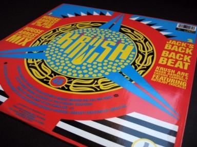
What’s often ignored is that 30 miles to the south of Sheffield – no further away than Leeds in fact – lies Nottingham. And while 1980s Sheffield could sometimes seem choked in Thatcher’s grip, Nottingham seemed like a laid-back city haven with better shops, nicer buildings, cooler bars. We could admit all that because there was no internecine rivalry to account for, and in any case, they were complementary talents as we still had the grit, the passion, the defiance; but sometimes, you just want a city to relax in, and for that, Nottingham was the place to go.
Parrot, the Sheffield DJ, was full of it:
“In Nottingham, people are 30 times better dressed than anybody in Sheffield and they’re all going crazy, sweating buckets, arms chucked high in the air,” he told Arrows in 1987, of the city’s club scene. “Nottingham’s always gonna be better ‘cos of all the fashion students there who are much trendier.”
As Parrot and Winston began changing the Sheffield scene from within, there were bonds forged with Nottingham. They admired Graeme Park, who was making big noises at The Garage; then he repaid the compliment in Sheffield, sharing The Steamer at the Leadmill with them – all before he made his name at the Haçienda, incidentally. The Beat Route organisation ran clubbing coach trips down the M1 and back – at a time when such excursions were a rarity; and Nottingham’s influence began to tell on the Sheffield scene, with Jive Turkey regulars quickly losing their inhibitions and realising that dancing was meant to be physical.
“You can tell the people who’ve been there,” said Parrot. “They’re all going crazy now in the same way, just having a good time.”
It made sense then that one of the first British house tracks to detonate in the mainstream was this one – House Arrest by Krush. Reaching number three in the autumn of 1987, it was a product of the Sheffield/Nottingham love-in; Mark Gamble and Cassius Campbell from Nottingham were joined by Ruthjoy on vocals, and the FON Force on production, and it was all fused together in deepest Sheffield – and dressed, of course, in finest DR.
At a time when ‘house’ still meant ‘Chicago’, there was a suspicion that British record buyers were being deliberately put off the scent by the slogan ‘Exclusive American Fashion’ on the sleeve; perhaps they would take it more seriously if they thought its origins were Stateside rather than Brightside? However, the track did make a break of sorts with the British dance records that had made the running in the slipstream of Jack Your Body and Love Can’t Turn Around; they had tended to be dense with easily identified samples and paid a heavy debt to cut ‘n’ paste heroes like Steinski: after all, it was the sample-heavy remix of Pump Up The Volume that accounted for much of that track’s success rather than the sparse, chilly soundscapes of the (far superior) original. House Arrest though did sound more American in its use of a sweet female vocal, but at the same time it was defiantly British in its simultaneous downgrading of the vocalist’s role and refusal to submit to the demands of ‘the song’. So the angelic melancholy of the vocal becomes just another texture, like that strange white noise whistle or the judder of the beat itself.
Without having any actual figures to prove it, I think it’s safe to say that House Arrest was the biggest success of FON’s short career, and it gave the work of a young Sheffield design studio some massive national exposure. For me, it also asserted that my city was alive and well; the Republic, which was in Yorkshire but not of it, still meant business.
Track sixteen
LFO – Track 4 (1990)
‘WARPED ART 100% GUARANTEED DESIGNERS REPUBLIC. THE PEOPLES FRIEND’
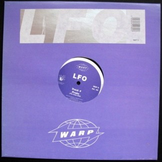
The beat is the law indeed.
This beat – this relentless, motorised tattoo – contains within its percussive rattle the pure essence of moving on a dancefloor. “Keep it locked,” as the pirate lads used to say: they meant don’t touch that dial of course, but really, they meant lock into the groove. Don’t stop, don’t stop.
As if you could.
As the very great Mark E. Smith once said:
“This is the three R’s, the three R’s. Repetition. Repetition. Repetition.“
For me, this track lays bare the delicious infinity of the groove; pulsing through flesh, demanding expression in the form of involuntary physical jerks. True, there are breakdowns; there are bass throbs and a synthetic steel drum; but the magnificence of this modest B side – on the flip of 1990’s stupendous LFO – is its unchanging pummel, its challenge to the soul.
It’s the point of the night at which you realise you must never stop moving; at which you know that you will stop moving, because the morning will always come; but in the meantime you will make believe that no power on Earth can prevent this ungodly twitch. And when eventually you head outside into the weak light of the sun, you’ll feel defeated; clutching at your bottle of lukewarm Evian and still chewing – trying to reclaim the night.
It isn’t dancing. It’s endurance.
And how it thrills!
Track seventeen
Bleep & Booster – Technotropolis (1991)
‘THE DESIGNERS REPUBLIC: THINKING & CREATING’
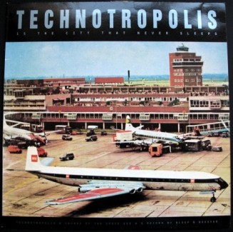
As the sun seeps through the rafters and the ravers begin to fade, from out of the headstrong comes forth sweetness: Technotropolis is luscious electro-pop engineered to deliver the futuristic sound of yesterday.
Bleep & Booster was a personal project of Stephen Singleton, once a genuine Top-Of-The-Pops-botherer as a member of ABC, and prior to that, one of the authentic Sheffield synth generation with his band Vice Versa. Bleep & Booster produced a couple of expansive electro singles and an album of melodic electronic pop; all seemed self-consciously concerned with a kind of Jet Age propaganda – a future-past of air travel and mainframe computers and unbounded optimism about the potential good of technology; as if the nuclear paranoia that accompanied the reality of this sky’s-the-limit thinking had never actually happened.

“Technotropolis is the city that never sleeps,” declaims the voice, bathed in sweet electronica. A nice idea, but no city I’ve ever lived in has behaved that way. And the Sheffield in which Bleep & Booster produced this music didn’t just sleep; it lapsed into a coma, night after night. Which just goes to show how the power of the imagination can deny the fact of existence completely; so that a city whose civic centrepiece was a malfunctioning fountain could be connected to Manhattan-via-Tokyo – dreamt up by the residents of Bladerunner.
The Designers Republic’s sleeve relies on a single untreated photograph – or rather two photos, one front, one back. Everything that the music wants to say is contained in these photos, leaving little for DR to do other than supply the context in which the images can exist. Here, they are content to let someone else’s pictures do the talking; and we must leave behind the sweet innocence of this track. Our flight is leaving; the departure gate is closing; the future is almost over.
Track eighteen
Pop Will Eat Itself – Can U Dig It?
From the album This Is The Day, This Is The Hour, This Is This! (1989)
‘THE PACKAGE DESIGN & THE ARTWORK BY THIS IS THE DESIGNERSTAR REPUBLICA’
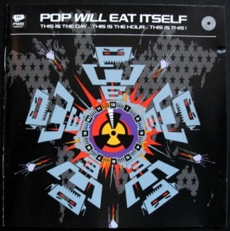
Brain Aided Dancing is about personal passions as much as it’s about the Designers Republic. Which is not quite the truth: it’s about my own steel-edged world view far more than it’s about the whys and wherefores of the mighty DR – or the miTDR as they have been known to style themselves (which, I like to think, is surely also an acronym for Made In The Designers Republic – a respectful nod towards the Made In Sheffield marque that indicates cutlery born within the sound of Def Leppard).
But here is an aberration – a track that I don’t really like that much, by a band that I’m equally ambiguous about. The CD from which it comes belongs to my wife: it’s one of those strange artefacts that becomes part of the furniture by stealth; you barely notice it’s there until one day you take a moment to peruse the CD shelves… and you pluck it from the plastic cuddle of its neighbours… and wonder for a moment how it got there; and remembering you’re married, you wonder if perhaps you’ll ever really know this person with whom you’re sharing your life.
OK; that’s a little harsh. My wife is not defined by her affection for this band; I can’t remember the last time I heard them being played on our teak-sided family radiogram. And as for me, you might wonder at a man who claims not to understand the charms of PWEI when he is clearly still enamoured with the rather less commercially successful, but not entirely dissimilar, Age Of Chance; being another band that a certain kind of white boy thinks is really on the edge.
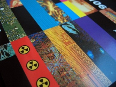
And listening to Can U Dig It? right here and now, Pop Will Eat Itself suddenly don’t seem such a mystery after all. The combination of metal and sampling can make for an explosive mix, and there’s the reeling off of pop lists, which appeals to the Hornby in all of us. (That’s Nick, rather than the train set manufacturer – though it occurs to me that there’s a rather delicious connection buried somewhere inside that coincidence). Plus – the reason why we’re here, after all – there’s the Designers Republic, who clearly relished the opportunity to deliver Age Of Chance Mk II while shifting rather more units in the process.
How many times do you hear it said – “I got into DR because of Pop Will Eat Itself”?
Admittedly, if you’re my mum, probably not many. But if you’ve spent more hours than is healthy in certain corners of the internet, then it’s a phrase you know well. So I feel they deserve their place here, and their track packs a punch in the mix – though they’re already making me feel uncomfortable, what with them being loppers and everything.
Those who shared my comprehensive school playground will know what I mean.
Anyone else will have to look it up.
Track nineteen
Age Of Chance – Kiss (Collision Cut) (1986)
‘SLEEVE MADE IN THE DESIGNERS REPUBLIC’
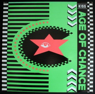
And so to the end. We conclude even before we began; not in a student bedroom in Coventry, but in the middle of the Leadmill’s musty dancefloor, a swill of Marston’s Pedigree doing tsunamis in my stomach. This is Sheffield, still in my pre-departure days; and music like this is something I don’t quite understand. I’m learning fast, but even so: we are losing the structure of ‘the song’, and the elongated drum passages are a puzzle. Here on the floor it makes a kind of sense, but I wonder if anyone ever plays this at home. And if they do, what do they think they’re listening to?
The sleeve, which I study while loitering in the FON Records shop, seems to mean something – but what? Is this a club, a gang? Should I comprehend these slogans, these symbols, these… things? ‘RIOT BIBLE’? ‘DEF, CRUSH, STAMINA, OVERDOSE’? ‘Sleeve made in the Designers Republic’? Never heard of it. Or them. Whatever they are.
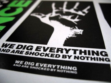
The original track is one that I know, of course; who doesn’t? But in these hands it seems to have had the funk scalpelled away; it is sparse and unadorned; it could have been recorded in the back of a van. In contrast to the panting and tingle of the Purple One’s version, we have an asexual yell delivered perhaps by a bloke with a megaphone at the back of a march; some kind of TUC tumble most likely; public sector, I’m sure; a spot of rowdiness outside the local health authority HQ, with pink men in suits watching from second floor windows.
Not the kind of thing that goes on in Minneapolis.
But that’s how Age Of Chance have changed this tune; and the Designers Republic – still unknown to me, remember – have robed it in something resembling agit-prop; or agit-prop as it should have been but never was; because I gaze at it and feel mobilised! Or, at least, ready to stamp my Doc Martens into the floor.

How far we are from righteous bass tones shaking down the walls of Babylon. This is hysterical treble, shrill and unreasonable, rattling at the Leadmill’s upper windows, up there above the derelict bogs, the gloss-painted plumbing, the council-backed bar. But in the street, you can’t hear it. This rage does not travel. It has no effect. And we know that next year, or whenever the time comes, Mrs Thatcher will win yet again; third term lucky. Round here we’ll have none of it, but it’s as if we don’t count.
Because it’s 1986, and our Republic is dead.
Or that’s what I thought.
How strange then, that really, it was only the start.
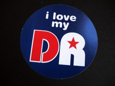
To all those servants of the Republic whose work I’ve loved over the years – ta very much. May your futures be ULTRA-BRITE!
The Brain Aided Dancing mix can be downloaded in MP3 form here. Alternatively, listen via the Mixcloud widget at the top of this page.
If you have enjoyed this article, this mix, or both, why not try Destroyed By Gods – my investigation into the freakish science behind the Sheffield sound?
If you would like to comment on ‘Brain Aided Dancing’, please get in touch via the Contact page on this website.
Text and images © Damon Fairclough 2009
Artwork represented within each image remains the property of the relevant copyright holder
Share this article
Follow me